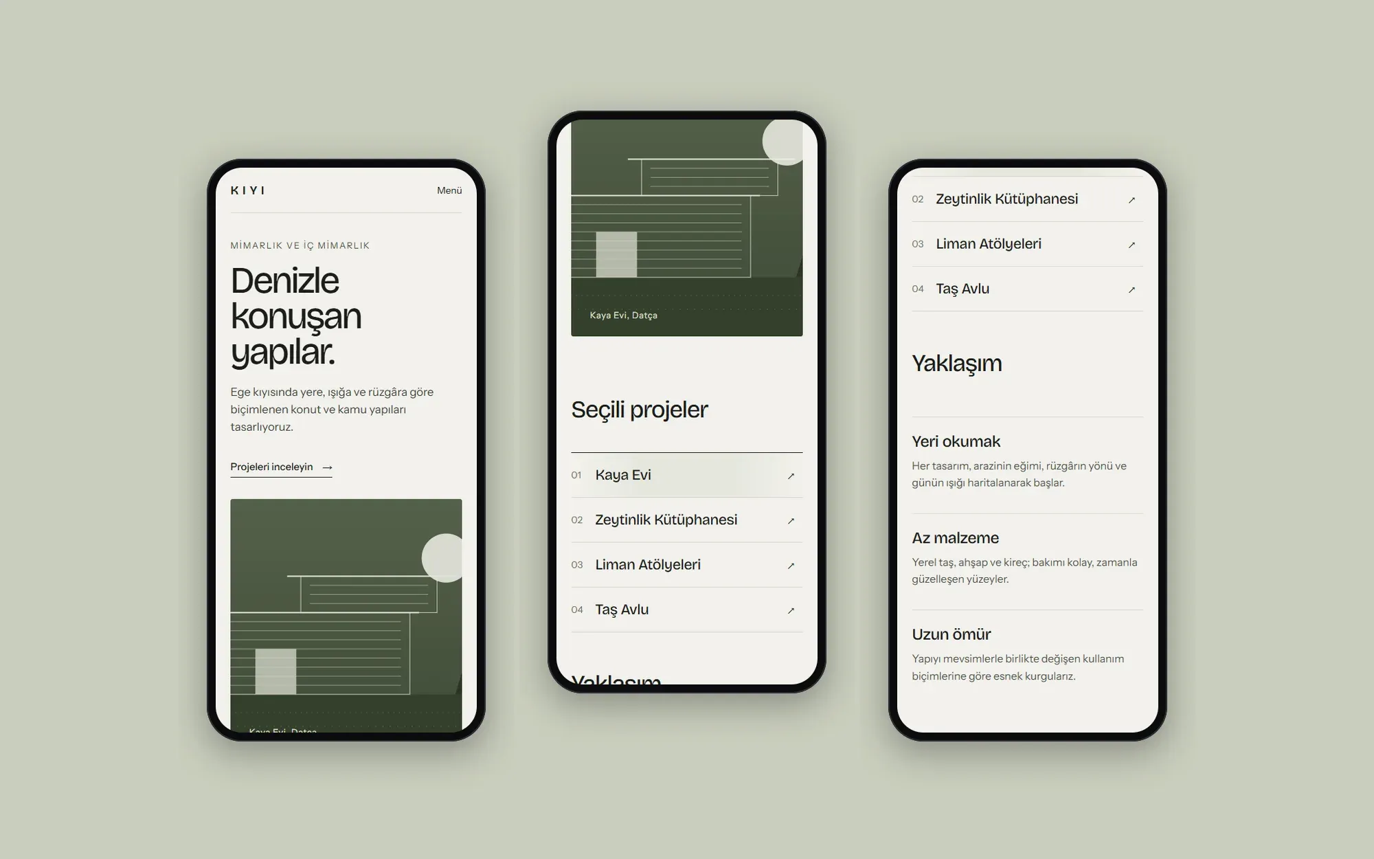
Kıyı Architecture
A calm, editorial corporate site concept for an architecture office on the Aegean coast, built to put its projects first.
- Client
- Concept work
- Sector
- Architecture
- Year
- 2026
- Services
- Corporate website, UI/UX design
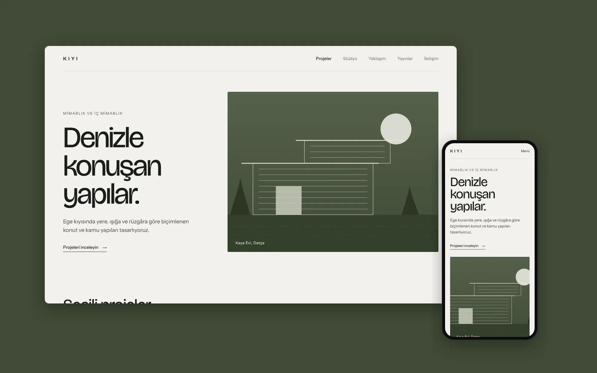
This is concept work. The brand, the content and the people shown in the interface are fictional. It was not made for a real client.
Problem
Architecture websites are often either slowed down by heavy imagery or squeeze every project into the same grid. For an office that designs for each specific place, the site had to tell each project as a story rather than a catalog entry. Visitors needed to understand the approach of the office on the first screen.
Approach
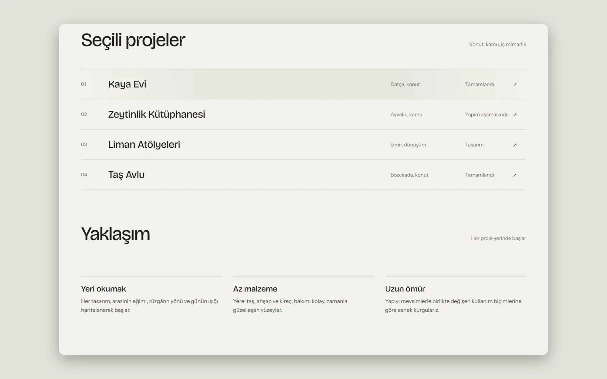
We drew the visual language from how the office works with materials: a lime-washed background, a single olive accent and large, tightly set headlines. Instead of an image-heavy grid, the project list is a quiet index that shows location, type and status on one line. The page loads fast, and each project can be told with large images on its own page.
The hero uses a line illustration of a facade instead of a photograph. This also keeps the site from looking unfinished until real project photos are added.
Outcome
The concept sets a design language across the home page, the project index and the approach section that stays equally calm on desktop and mobile. On mobile the index collapses to one column while the order of headline and image is kept.